Chapter 3 Describing the observations
Statistics is the grammar of science (K. Pearson)
The final outcome of every manipulative/comparative experiment is a dataset, consisting of a set of measures/observations taken on several experimental subjects, in relation to one or more properties (e.g., height, weight, concentration, sex, color). We have seen that the list of values for one of those properties is called a variable; our first task is to describe that variable, by using the most appropriate descriptive stats. In this respect, the different types of variables (see Chapter 2) will require different approaches, as we will see in this chapter.
3.1 Quantitative data
For a quantitative variable, we need to describe:
- location
- spread
- shape
The three statistics respond, respectively, to the following questions: (1) where are the values located, along the measurement scale? (2) how close are the values to one another? (3) are the values symmetrically distributed around the central value, or are they skewed to the right or to the left?
In this chapter, we will only consider the statistics of location and spread, as the statistics of shape are not commonly reported in agriculture and biology.
3.1.1 Statistics of location
The most widely known statistic of location is the mean, that is obtained as the sum of data, divided by the number of values:
\[\mu = \frac{\sum\limits_{i = 1}^n x_i}{n}\]
For example, let us consider the following variable, listing the heights of four maize plants: \(x = [178, 175, 158, 153]\)
The mean is easily calculated as:
\[\mu = \frac{178 + 175 + 158 + 153}{4} = 166\]
The mean can be regarded as the central value in terms of Euclidean distances; indeed, by definition, the sum of the Euclidean distances between the values and the group mean is always zero. In other words, the values above the mean and those below the mean, on average, are equally distant from the mean. That does not imply that the number of values above the mean is the same as the number of values below the mean. For example, if we look at the following values:
1 - 4 - 7 - 9 - 10
we see that the mean is 6.2. If we change the highest value into 100, the new mean is moved upwards to 24.2 and it is no longer in central positioning, with respect to the sorted list of data values.
Another important statistic of location is the median, i.e. the central value in a sorted variable. The calculation is easy: first of all, we sort the values in increasing order. If the number of values is odd, the median is given by the value in the \((n + 1)/2\) position (\(n\) is the number of values). Otherwise, if the number of values is even, we take the two values in the \(n/2\) and \(n/2 + 1\) positions and average them.
The median is always the central value in terms of positioning, i.e., the number of values above the median is always equal to the number of values below the median. For example if we take the same values as above (1 - 4 - 7 - 9 - 10), the median is equal to 7 and it is not affected when we change the highest value into 100. Considering that extreme values (very high or very low) are usually known as outliers, we say that the median is more robust than the mean with respect to outliers.
3.1.2 Statistics of spread
Knowing the location of a variable is not enough for our purpose as we miss an important information: how close are the values to the mean? The simplest statistic to express the spread is the range, that is the difference between the highest and lowest value. This is a very rough indicator, though, as it is extremely sensitive to outliers.
In the presence of a few outliers, the median is used as a statistic of location and, in that case, it can be associated, as a statistic of spread, to the interval defined by the 25th and 75th percentiles. In general, the percentiles, are the values below which a given percentage of observations falls. More specifically, the 25th percentile is the value below which 25% of the observations falls and the 75th percentile is the value below which 75% of the observations falls (you may have understood that the median corresponds to the 50th percentile). The interval between the 25th and 75th percentile, consequently, contains 50% of all the observed values and, therefore, it is a good statistic of spread.
If we prefer to use the mean as a statistic of location, we can use several other important statistics od spread; the first one, in order of calculation, is the deviance, that is also known as the sum of squares. It is the sum of squared differences between each value and the mean:
\[SS = \sum\limits_{i = 1}^n {(x_i - \mu)^2 }\]
In the above expression, the amounts \(x_i - \mu\) (differences between each value and the group mean) are known as residuals. For our sample, the deviance is:
\[SS = \left(178 - 166 \right)^2 + \left(175 - 166 \right)^2 + \left(158 - 166 \right)^2 + \left(153 - 166 \right)^2= 458\]
A high deviance corresponds to a high spread; however, we can have a high deviance also when we have low spread and a lot of values. Therefore, the deviance should not be used to compare the spread of two groups with different sizes. Another problem with the deviance is that the measurement unit is also squared with respect to the mean: for our example, if the original variable (height) is measured in cm, the deviance is measured in cm2, which is not very logical.
A second important measure of spread is the variance, that is usually obtained dividing the deviance by the number of observations minus one:
\[\sigma^2 = \frac{SS}{n - 1}\]
For our group:
\[\sigma^2 = \frac{458}{3} = 152.67\]
The variance can be used to compare the spread of two groups with different sizes, but the measurement unit is still squared, with respect to the original variable.
The most important measure of spread is the standard deviation, that is the square root of the variance:
\[\sigma = \sqrt{\sigma^2} = \sqrt{152.67} = 12.36\]
The measurement unit is the same as the data and, for this reason, the standard deviation is the most important statistic of spread and it is usually associated to the mean to summarise a set of measurements. In particular, the interval \(l = \mu \pm \sigma\) is often used to describe the absolute uncertainty of replicated measurements.
Sometimes, the standard deviation is expressed as a percentage of the mean (coefficient of variability), which is often used to describe the relative uncertainty of measurement instruments:
\[CV = \frac{\sigma }{\mu } \times 100\]
3.1.3 Summing the uncertainty
In some cases, we measure two quantities and sum them to obtain a derived quantity. For example, we might have made replicated measurements to determine the sucrose content in a certain growth substrate, that was equal to \(22 \pm 2\) (mean and standard deviation). Likewise, another independent set of measures showed that the fructose content in the same substrate was \(14 \pm 3\). Total sugar content is equal to the sum of \(22 + 14 = 36\). The absolute uncertainty for the sum is given by the square root of the sum of the squared absolute uncertainties, that is \(36 \pm \sqrt{4 + 9}\). The absolute uncertainty for a difference is calculated in the very same way.
3.1.4 Relationship between quantitative variables
Very frequently, we may have recorded, on each subject, two, or more, quantitative traits, so that, in the end, we have two, or more, response variables. We might be interested in assessing whether, for each pair of variables, when one changes, the other one changes, too (joint variation). The Pearson correlation coefficient is a measure of joint variation and it is equal to the codeviance of the two variables divided by the square root of the product of their deviances:
\[r = \frac{ \sum_{i=1}^{n}(x_i - \mu_x)(y_i-\mu_y) }{\sqrt{\sum_{i=1}^{n}(x_i-\mu_x)^2 \sum_{i=1}^{n}(y_i-\mu_y)^2}}\]
We know about the deviance, already. The codeviance is a statistic that consists of the product of the residuals for the two variables: it is positive, when the residuals for the two variables have the same signs, otherwise it is negative. Consequently, the \(r\) coefficient ranges from \(+1\) to \(-1\): a value of \(+1\) implies that, when \(x\) increases, \(y\) increases by a proportional amount, so that the points on a scatterplot lie on a straight line, with positive slope. On the other hand, a value of \(-1\) implies that when \(x\) increases, \(y\) decreases by a proportional amount, so that the points on a scatterplot lie on a straight line, with negative slope. A value of 0 indicates that there is no joint variability, while intermediate values indicate a more or less high degree of joint variability, although the points on a scatterplot do not exactly lie on a straight line (Figure 3.1).
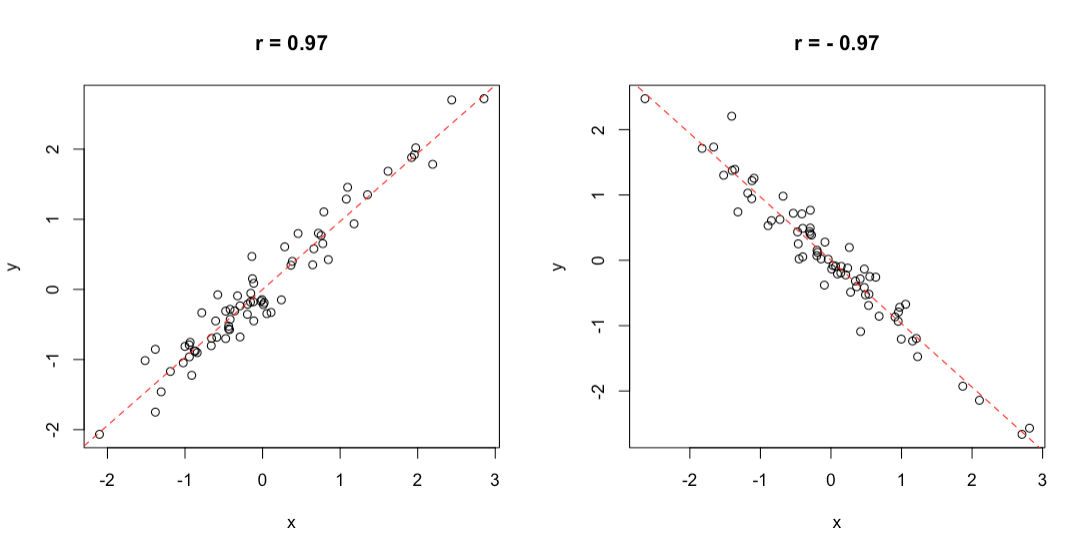
Figure 3.1: Example of positive (left) and negative (right) correlation
For example, if we have measured the oil content in sunflower seeds by using two different methods, we may be interested in describing the correlation between the results of the two methods. The observed data are shown in the box below.
In order to calculate the correlation coefficient, we need to organise our calculations as follows:
- calculate the residuals for A (\(z_A\))
- calculate the residuals for B (\(z_B\))
- calculate the deviances and codeviance
First of all, we calculate the two means, that are, respectively, 46.22 and 45.44. Secondly, we can calculate the residuals for both variables, as shown in Table 3.1. From the residuals, we can calculate the deviances and the codeviance, by using the equation above.
| A | B | \(z_A\) | \(z_B\) | \(z_A^2\) | \(z_B^2\) | \(z_A \times z_B\) |
|---|---|---|---|---|---|---|
| 45 | 44 | -1.222 | -1.444 | 1.494 | 2.086 | 1.765 |
| 47 | 44 | 0.778 | -1.444 | 0.605 | 2.086 | -1.123 |
| 49 | 49 | 2.778 | 3.556 | 7.716 | 12.642 | 9.877 |
| 51 | 53 | 4.778 | 7.556 | 22.827 | 57.086 | 36.099 |
| 44 | 48 | -2.222 | 2.556 | 4.938 | 6.531 | -5.679 |
| 37 | 34 | -9.222 | -11.444 | 85.049 | 130.975 | 105.543 |
| 48 | 47 | 1.778 | 1.556 | 3.160 | 2.420 | 2.765 |
| 42 | 39 | -4.222 | -6.444 | 17.827 | 41.531 | 27.210 |
| 53 | 51 | 6.778 | 5.556 | 45.938 | 30.864 | 37.654 |
The deviances for \(A\) and \(B\) are, respectively, 189.55 and 286.22, while the codeviance is 214.11. Accordingly, the correlation coefficient is:
\[r = \frac{214.11}{\sqrt{189.55 \times 286.22}} = 0.919\]
It is close to 1, so we conclude that there was quite a good agreement between the two methods.
3.2 Nominal data
3.2.1 Distributions of frequencies
With nominal data, we can only assign the individuals to one of a number of categories. In the end, the only description we can give of such a dataset is based on the counts (absolute frequencies) of individuals in each category, producing the so called distribution of frequencies.
As an example of nominal data we can take the ‘mtcars’ dataset, that was extracted from the 1974 Motor Trend US magazine and comprises 32 old automobiles. The dataset is available in R and we show part of it in table 3.2.
| vs | gear | |
|---|---|---|
| Mazda RX4 | 0 | 4 |
| Mazda RX4 Wag | 0 | 4 |
| Datsun 710 | 1 | 4 |
| Hornet 4 Drive | 1 | 3 |
| Hornet Sportabout | 0 | 3 |
| Valiant | 1 | 3 |
| Duster 360 | 0 | 3 |
| Merc 240D | 1 | 4 |
| Merc 230 | 1 | 4 |
| Merc 280 | 1 | 4 |
| Merc 280C | 1 | 4 |
| Merc 450SE | 0 | 3 |
| Merc 450SL | 0 | 3 |
| Merc 450SLC | 0 | 3 |
| Cadillac Fleetwood | 0 | 3 |
| Lincoln Continental | 0 | 3 |
| Chrysler Imperial | 0 | 3 |
| Fiat 128 | 1 | 4 |
| Honda Civic | 1 | 4 |
| Toyota Corolla | 1 | 4 |
| Toyota Corona | 1 | 3 |
| Dodge Challenger | 0 | 3 |
| AMC Javelin | 0 | 3 |
| Camaro Z28 | 0 | 3 |
| Pontiac Firebird | 0 | 3 |
| Fiat X1-9 | 1 | 4 |
| Porsche 914-2 | 0 | 5 |
| Lotus Europa | 1 | 5 |
| Ford Pantera L | 0 | 5 |
| Ferrari Dino | 0 | 5 |
| Maserati Bora | 0 | 5 |
| Volvo 142E | 1 | 4 |
The variable ‘vs’ in ‘mtcars’ takes the values 0 for V-shaped engine and 1 for straight engine. Obviously, the two values 0 and 1 are just used to name the two categories and the resulting variable is purely nominal. The absolute frequencies of cars in the two categories are, respectively 18 and 14 and they are easily obtained by a counting process.
We can also calculate the relative frequencies, dividing the absolute frequencies by the total number of observations. These frequencies are, respectively, 0.5625 and 0.4375.
If we consider a variable where the classes can be logically ordered, we can also calculate the cumulative frequencies, by summing up the frequency for one class with the frequencies for all previous classes. As an example we take the ‘gear’ variable in the ‘mtcars’ dataset, showing the number of forward gears for each car. We can easily see that 15 cars have 3 gears and 27 cars have 4 gears or less.
In some circumstances, it may be convenient to ‘bin’ a continuous variable into a set of intervals. For example, if we have recorded the ages of a big group of people, we can divide the scale into intervals of five years (e.g., from 10 to 15, from 15 to 20 and so on) and, eventually, assign each individual to the appropriate age class. Such a technique is called binning or bucketing and we will see an example later on in this chapter.
3.2.2 Descriptive stats for distributions of frequencies
For categorical data, we can retrieve the mode, which is the class with the highest frequency. For ordinal data, wherever distances between classes are meaningful, and for discrete data, we can also calculate the median and other percentiles, as well as the mean and other statistics of spread (e.g., variance, standard deviation). The mean is calculated as:
\[ \mu = \frac{\sum\limits_{i = 1}^n f_i x_i}{\sum\limits_{i = 1}^n f_i}\]
where \(x_i\) is the value for the i-th class, and \(f_i\) is the frequency for the same class. Likewise, the deviance, is calculated as:
\[ SS = \sum\limits_{i = 1}^n f_i (x_i - \mu)^2 \]
For example, considerin the ‘gear’ variable in Table 3.2, the average number of forward gears is:
\[\frac{ 15 \times 3 + 12 \times 4 + 5 \times 5}{15 + 12 + 5} = 3.6875\]
while the deviance is:
\[SS = 15 \times (3 - 3.6875)^2 + 12 \times (4 - 3.6875)^2 + 5 \times (5 - 3.l875)^2 = 16.875\]
With interval data (binned data), descriptive statistics should be calculated by using the raw data, if they are available. If they are not, we can use the frequency distribution obtained from binning, by assigning to each individual the central value of the interval class to which it belongs. As an example, we can consider the distribution of frequencies in Table 3.3, relating to the time (in minutes) taken to complete a statistic assignment for a group of students in biotechnology. We can see that the mean is equal to:
\[ \frac{7.5 \times 1 + 12.5 \times 4 + 17.5 \times 3 + 22.5 \times 2}{10} = 15.5\]
| Time interval | Central value | Count |
|---|---|---|
| 5 - 10 | 7.5 | 1 |
| 10 - 15 | 12.5 | 4 |
| 15 - 20 | 17.5 | 3 |
| 20 - 25 | 22.5 | 2 |
The calculation of the deviance is left as an exercise.
3.2.3 Contingency tables
When we have more than one cataegorical variable, we can summarise the distribution of frequency by using two-way tables, usually known as contingency tables or crosstabs. For example, we can consider the ‘HairEyeColor’ dataset, in the ‘datasets’ package, which is part of the base R installation. It shows the contingency tables of hair and eye color in 592 statistics students, depending on sex; both characters are expressed in four classes, i.e. black, brown, red and blond hair and brown, blue, hazel and green eyes. Considering females, the contingency table is reported in Table 3.4 and it is augmented with row and column sums (see later).
| Brown eye | Blue eye | Hazel eye | Green eye | ROW SUMS | |
|---|---|---|---|---|---|
| Black hair | 36 | 9 | 5 | 2 | 52 |
| Brown hair | 66 | 34 | 29 | 14 | 143 |
| Red hair | 16 | 7 | 7 | 7 | 37 |
| Blond hair | 4 | 64 | 5 | 8 | 81 |
| COLUMN SUMS | 122 | 114 | 46 | 31 | 313 |
3.2.4 Independence
With a contingency table, we may be interested in assessing whether the two variables show some sort of dependency relationship. In the previous example, is there any relationship between the color of the eyes and the color of the hair? If not, we say that the two variables are independent. Independency is assessed by using the \(\chi^2\) statistic.
As the first step, we need to calculate the marginal frequencies, i.e. the sums of frequencies by row and by column (please note that the entries of a contingency table are called joint frequencies). These sums are reported in Table 3.4.
Let’s consider black hair: in total there are 52 women with black air, that is \(52/313 \times 100 = 16.6\)% of the total. If the two characters were independent, the above proportion should not change, depending on the color of eyes. For example, we have 122 women with brown eyes and 16.6% of those should be black haired, which makes up an expected value of 20.26837 black haired and brown eyed women (much lower than the observed 36). Another example: the expected value of blue eyed and black haired women is \(114 \times 0.166 = 18.9\) (much higher than the observed). A third example may be useful: in total, there is \(143/313 = 45.7\)% of brown haired women and, in case of independence, we would expect \(46 \times 0.457 = 21.02\) brown haired and hazel eyed woman. Keeping on with the calculations, we could derive a table of expected frequency, in the case of complete independence between the two characters. All the expected values in case of independency are reported in Table 3.5.
| Brown eye | Blue eye | Hazel eye | Green eye | ROW SUMS | |
|---|---|---|---|---|---|
| Black hair | 20.26837 | 18.93930 | 7.642173 | 5.150160 | 52 |
| Brown hair | 55.73802 | 52.08307 | 21.015974 | 14.162939 | 143 |
| Red hair | 14.42173 | 13.47604 | 5.437700 | 3.664537 | 37 |
| Blond hair | 31.57189 | 29.50160 | 11.904153 | 8.022364 | 81 |
| COLUMN SUMS | 122.00000 | 114.00000 | 46.000000 | 31.000000 | 313 |
The observed (table 3.4) and expected (Table 3.5) values are different, which might indicate a some sort of relationship between the two variables; for example, having red hair might imply that we are more likely to have eyes of a certain color. In order to quantify the discrepancy between the two tables, we calculate the \(\chi^2\) stat, that is:
\[\chi ^2 = \sum \left[ \frac{\left( {f_o - f_e } \right)^2 }{f_e } \right]\]
where \(f_o\) are the observed frequencies and \(f_e\) are the expected frequencies. For example, for the first value we have:
\[\chi^2_1 = \left[ \frac{\left( {36 - 20.26837 } \right)^2 }{20.26837 } \right]\]
In all, we should calculate 16 ratios and sum them to each other. The final \(\chi^2\) value should be equal to 0 in case of independence and it should increase as the relationship between the two variables increases, up to:
\[\max \chi ^2 = n \cdot \min (r - 1,\,c - 1)\]
i.e. the product between the number of subjects (\(n\)) and the minimum value between the number of rows minus one and the number of columns minus one (in our case, it is \(313 \times 3 = 939\)).
The observed value is 106.66 and it suggests that the two variables are not independent.
3.3 Descriptive stats with R
Before reading this part, please make sure that you already have some basic knowledge about the R environment. Otherwise, please go and read the Appendix 1 to this book.
Relating to quantitative variables, we can use the dataset ‘heights.csv’, that is available in an online repository and refers to the height of 20 maize plants. In R, the mean is calculated by the function mean(), as shown in the box below.
filePath <- "https://www.casaonofri.it/_datasets/heights.csv"
dataset <- read.csv(filePath, header = T)
mean(dataset$height)
## [1] 164
The median is obtained by using the function median():
The other percentiles are calculated with the function quantile(), passing the selected probabilities as fractions in a vector:
The deviance function is not immediately available in R and we should resort to using the following expression:
The other variability stats are straightforward to obtain, as well as the correlation coefficient:
# Variance and standard deviation
var(dataset$height)
## [1] 213.1579
sd(dataset$height)
## [1] 14.59993
# Coefficient of variability
sd(dataset$height)/mean(dataset$height) * 100
## [1] 8.902395
# Correlation
cor(A, B)
## [1] 0.9192196
We have just listed some of the main stats that can be used to describe the properties of a quaantitative variable. In our research work we usually deal with several groups of observations, each one including the different replicates of one of a series of experimental treatments. Therefore, we need to be able to obtain the descriptive stats for all groups at the same time. The very basic method to do this, is by using the function tapply(), which takes three arguments, i.e. the vector of observations, the vector of groups and the function to be calculated by groups. The vector of groups is the typical accessory variable, which labels the observations according to the group they belong to.
dataset$var
##  [1] "N" "S" "V" "V" "C" "N" "C" "C" "V" "N" "N" "N" "S" "C" "N" "C"
## [17] "V" "S" "C" "C"
mu.height <- tapply(dataset$height, dataset$var, FUN = mean)
mu.height
##      C      N      S      V
## 165.00 164.00 160.00 165.25
Obviously, the argument FUN can be used to pass any other R function, such as median and sd. In particular, we can get the standard deviations by using the following code:
sigma.height <- tapply(dataset$height, dataset$var, sd)
sigma.height
##        C        N        S        V
## 14.36431 16.19877 12.16553 19.51709
Now, we can combine the two newly created vectors into a summary dataframe. In the box below, we use the function data.frame() to combine the vector of group names and the two vectors of stats to create the ‘descStat’ dataframe, which is handy to create a table or a graph, as we will see later.
descStat <- data.frame(group = names(mu.height),
                       mu = mu.height,
                       sigma = sigma.height)
descStat
##   group     mu    sigma
## C     C 165.00 14.36431
## N     N 164.00 16.19877
## S     S 160.00 12.16553
## V     V 165.25 19.51709
With nominal data, the absolute frequencies of individuals in the different classes can be retrieved by using the table() function, as we show below for the ‘vs’ variable in the ‘mtcars’ dataset.
We can also calculate the relative frequencies, dividing by the total number of observations.
Cumulative frequencies can be calculated by the cumsum() function, as shown below for the ‘gear’ variable in the ‘mtcars’ dataset.
Ragarding to binning, we can consider the ‘co2’ dataset, that is included in the base R installation. It contains 468 values of CO_2_ atmospheric concentrations, expressed in parts per million, as observed at monthly intervals in the US. With such a big dataset, the mean and standard deviation are not sufficient to get a good feel for the data and it would be important to have an idea of the shape of the dataset. Therefore we can split the continuous scale into a series of intervals, from 310 ppm to 370 ppm, with breaks every 10 ppm and count the observations in each interval. In the box below, the function cut() assigns each value to the corresponding interval (please note the ‘breaks’ argument, which sets the margins of each interval. Intervals are, by default, left open and right-closed), while the function table() calculates the frequencies.
data(co2)
co2 <- as.vector(co2)
mean(co2)
## [1] 337.0535
min(co2)
## [1] 313.18
max(co2)
## [1] 366.84
# discretization
classes <- cut(co2, breaks = c(310,320,330,340,350,360,370))
freq <- table(classes)
freq
## classes
## (310,320] (320,330] (330,340] (340,350] (350,360] (360,370]
##        70       117        86        76        86        33
The table() function is also used to create contingency tables, with two (or more) classification factors. The resulting table represent a peculiar class, which is different from other tabular classes, such as arrays and dataframes. This class has methods on its own, as we will see below. In the case of the ‘HairEyeColor’ dataset, this is already defined as a contingency table of class ‘table’.
data(HairEyeColor)
tab <- HairEyeColor[,,2]
class(tab)
## [1] "table"
tab
##        Eye
## Hair    Brown Blue Hazel Green
##   Black    36    9     5     2
##   Brown    66   34    29    14
##   Red      16    7     7     7
##   Blond     4   64     5     8
With such a class, we can calculate the \(\chi^2\) value by using the summary() method, as shown in the box below.
summary( tab )
## Number of cases in table: 313
## Number of factors: 2
## Test for independence of all factors:
##  Chisq = 106.66, df = 9, p-value = 7.014e-19
##  Chi-squared approximation may be incorrect
The above function returns several results, which we will examine in further detail in a following chapter.
3.4 Graphical representations
Apart from tables, also graphs can be used to visualise our descriptive stats. Several types of graphs are possible, and we would like to mention a few possibilities.
A barplot is very useful to visualise the properties of groups, e.g. their means or absolute frequencies. For example, if we consider the ‘descStat’ dataframe we have created above at 3.1.3, we could draw a barplot, where the height of bars indicate the mean for each group and we could augment such a barplot by adding error bars to represent the standard deviations (\(\mu \pm \sigma\)).
In the box below, we use the function barplot, which needs two arguments and an optional third one: the first one is the height of bars, the second one is the name of groups, the third one specifies the limits for the y-axis. We see that the function is used to return the object ‘coord’, a vector including the abscissas for the central point of each bar. We can use this vector inside the function arrows() to superimpose the error bars (Figure 3.2); the first four arguments of the arrows() function are, respectively, the coordinates of points from which (abscissa and ordinate) and to which (abscissa and ordinate) to draw the error bars, while the other arguments permit to fine tune the type of arrow.
coord <- barplot(descStat$mu, names.arg = descStat$group,
                 ylim = c(0, 200), ylab = "Height (cm)")
arrows(coord, descStat$mu - descStat$sigma,
       coord, descStat$mu + descStat$sigma,
       length = 0.05, angle = 90, code = 3)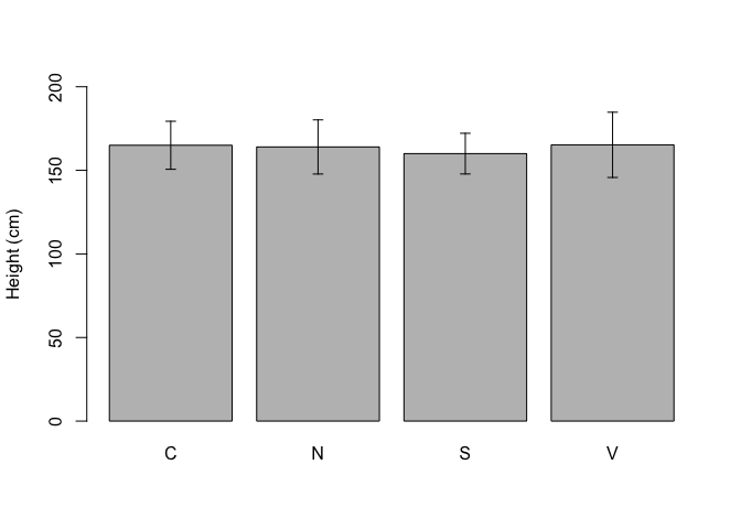
Figure 3.2: Example of a simple barplot in R
The graph is rather basic, but, with little exercise, we can improve it very much.
When the number of replicates is high (e.g., > 15), we can jointly use the 25th, 50th (median) and 75th percentiles to draw the so-called boxplot (Box-Whisker plot; Figure 3.3). I will describe it by using an example: let’s assume we have made an experiment with three treatments (A, B and C) and 20 replicates. We can use the code below to draw a boxplot.
rm(list = ls())
A <- c(2, 31, 12, 12, 17, 13, 0, 5, 13, 10,
       14, 11, 6, 18, 6, 17,  6, 5, 4, 5)
B <- c(8, 8, 5, 3, 6, 18, 13, 20, 19, 3,
       11, 7, 8, 12, 6, 17, 6, 7,  22, 18)
C <- c(12, 12, 9, 7, 10, 22, 17, 24, 23, 7,
       15, 11, 12, 16, 10, 21, 10, 11, 26, 22)
series <- rep(c("A", "B", "C"), each = 20)
values <- c(A, B, C)
boxplot(values ~ series)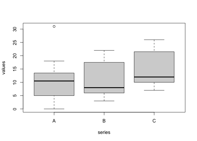
Figure 3.3: A boxplot in R
In this boxplot, each group is represented by a box, where the uppermost side is the 75th percentile, the lowermost side is the 25th percentile, while a line is drawn to indicate the median (50th percentile). Two vertical arrows (whiskers) start from the 25^th and 75^th percentile and reach the maximum and minimum values for each group. In the case of treatment A, the maximum value is 31, which is 20.5 units above the median. As this difference is higher than 1.5 times the difference from the median and the 75th percentile, this value is excluded, it is regarded as an outlier and it is represented by an empty circle.
For the case when we have a pair of quantitative variables, we can draw a scatterplot, by using the two variables as the co-ordinates. The simplest R plotting function is plot() and an example of its usage is given in Figure 3.4), with reference to the correlation data at 3.1.5.
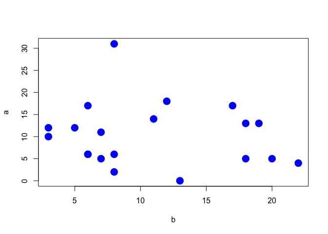
Figure 3.4: Scatterplot showing the correlation between two variables
A distribution of frequency can also be represented by using a pie chart, as shown in Figure 3.5), for the ‘gear’ variable in the ‘mtcars’ dataset.
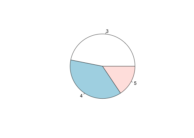
Figure 3.5: Representation of a distribution of frequencies by using a pie chart